B2CORE iOS v1.14.0 Released. Now With Even More Features!

We are pleased to announce the release of a new version of our B2CORE iOS app, which includes many new features to make the user’s experience easier and more informative.
These new features include:
- The ability to instantly sign in via Face ID
- Funding limits in connection with KYC procedures
- A ‘What’s New’ pop-up screen
- Verification pop-up modal screens.
In addition to the new features, we have made several enhancements to the Trading Platform cards, as well as a redesigned Verification screen.
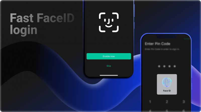
Instantly Sign-In with Face ID
Accessing your apps quickly and efficiently is essential in today’s fast-paced world. That’s why the ability to sign in via Face ID immediately after launching the app is so convenient. If you’ve already been signed in or authorized, and you close the app, this feature allows you to get back into the app immediately via Face ID authorization. This feature is not only convenient, but it’s also secure, as Face ID is one of the most advanced authentication methods available. There’s no need to fumble around with passwords or usernames; simply launch the app, and you’re good to go.
Funding Limits According to Verification Levels
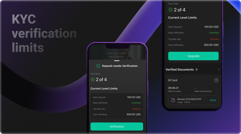
When you log into your account, you will now be able to see your current KYC verification level and the transaction limits associated with that level. This information is displayed on the Verification screen, which can be found in the Settings menu and the Verification Pop-up windows. The limits are on the amount of money you can deposit, withdraw, or transfer in a single day in accordance with your KYC verification level. Once you reach your limit, you can increase your verification level by submitting additional identification documents. The better the system can verify your identity and trading rights in your current jurisdiction, the greater the daily limits and monthly deposit/withdrawal amounts.
‘What’s New’ Screen
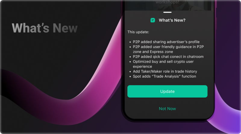
To let users know when an update is available on the App Store, we added a ‘What’s New’ screen. The screen displays the complete release notes describing the update, including any new features or enhancements. When there is a new version of the app available in the AppStore, the notification screen will appear on the Dashboard when the app is launched. ‘What’s New’ screen also includes an update button that will send the user to the App Store to download the latest version of our app. We believe this is a convenient way for users to stay up-to-date on our latest releases!
Verification Pop-up Modal Windows
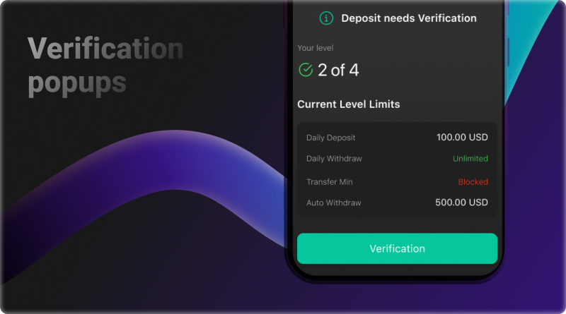
Safety and security are our top priorities. In order to ensure the security of our users, we have implemented a new Verification pop-up modal window. This window will appear whenever access to certain operations is limited by insufficient KYC verification level. In the window will be the explanation of the limitations of the current verification level and a request for the user to proceed to the screen to provide appropriate documentation. For example, if a user attempts to deposit via the “Deposit” option, but their current verification level blocks this operation, they will be informed of this fact, shown the limits of the operations for their current level, and offered a button to go to the verification screen to upgrade it. We hope to provide our users with a more secure experience by implementing the new measure.
Further UI Enhancements
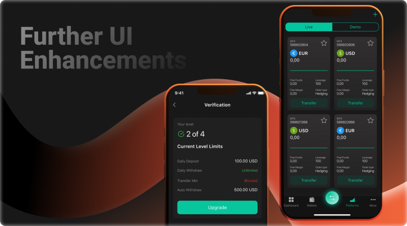
We are excited to announce a significant enhancement to our application design, beginning with improvements to the Trading Platforms cards. We now display Leverage, Free Funds, Free Margin, and Order type in the Trading Platforms cards. Also, the user can now deposit to the trading platforms through the button on the Transfer card. This change will help users make more informed decisions when trading and provide an easy way to fund their accounts.
Want to See It in Action?
Book a live walkthrough of the tools you're reading about — tailored to your business model.
Furthermore, the Verification screen has been completely redesigned with the user in mind. It is now easier to see what level of verification you are currently at and how many more levels there are to go. Transaction limits have also been added to see which operations you can perform with your current verification level. The status of your documents is also displayed, so you can easily see which ones still need to be uploaded for verification, in addition to the already verified documents you have used for verification purposes. Overall, the new Verification screen is a significant improvement that will make it easier for users to get verified and keep track of their progress.
Conclusion
The current version represents the start of the transition to a new application design. We aim to make the interface more efficient to satisfy the user’s trading objectives, and in the upcoming version, we will implement a significant number of UI modifications. The new design will streamline processes and make it easier for users to switch between tasks.
Discover the Tools That Power 500+ Brokerages
Explore our complete ecosystem — from liquidity to CRM to trading infrastructure.
We will continue to work hard to provide the best possible experience, and we hope that our users will enjoy the latest improvements. We are excited about these changes and believe they will help us better serve our loyal customers. So download the latest app and try it yourself – we think you’ll love all the new features! If you have any questions or feedback, please don’t hesitate to contact us. See you next time!


